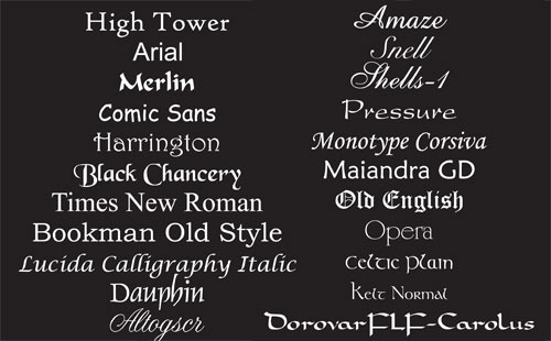
Typeface/ Font used:^^^^^^ Here is an example of many font types, some are really good and some are really bad. For example; for our own film we would we using a similar font type to the one which says ' Pressure' this is because I believe it would suit the background of the film because its thin writing not thick. Therefore, we can fit more things to say in the title sequence. Furthermore, the writing is going to be in ' White ' due to the reason we're going to film in the dark and white and black goes together. Also, many popular title sequences used that type of font such as; Ghost protocol, expendables and many more. On the other hand, if we was to use the font type which says ' snell' that wouldn't be good for us and the audience because they wouldn't understand what is written, its not that clear and would not appeal to our target audience of 18-25 year olds.
Use of transitions and/ or effects: We would use transitions for our logo ident before the title sequence like we did previously. We could use the glitch effect as it would suit the background of our film or even the genre. We wouldn't use anything that's childish as our target audience is 18-25 so the logo ident has to be suitable for them. Also, the logo ident shouldn't be anything too cliche. In addition, in our film there would be many fades so we are going to need to use transitions to slowly fade from one scene to another. Moving onto the effects we would use in our film, there are many effects such as, 'Heart beat', 'breathing ', and the ringing you hear in your ears and many more. 'Heart beat' is one of the best effects out there because it grabs the audiences attention and they start asking themselves 'Whats going to happen next?'. Its a great way to build tension. Also, the 'Heavy breathing' will be used with a mixture to the 'heart beat' to make the audience understand that its a life and death situation.

Use of colour:^^^^ The colour palettes that we're going to use for our film will be dark colours, burgundy, deep red and orange. This is because our film will be filmed in the dark so these are the suitable colour palettes that we would be using. We cant use light colours because that would be weird and not fitting in with the film and the plot and we are also filming in the dark and light colours wouldn't match.
Pace and movement of the titles: The pace of the titles would be definitely 'Slow'. This is because if it was fast then the audience wouldn't have the time to read what the credits are saying. For our re-make of ' Gone Girl ' our titles are were pretty fast and we couldn't read what written so we have to improve that for our film. Also, the titles are ' Slow ' to suit whats happening in the background of our film. If the background is fast then the titles should be fast too so it could match.
How do they integrate or contrast with the action behind them?: As i said before, it should suit whats happening in the background. Fit in with everything but not take attention away from the film.
No comments:
Post a Comment