
Saturday, 31 December 2016
Friday, 30 December 2016

analysing strengths and weaknesses of my blog
Strengths:
My blog appears to be organised and neat, with bold titles and colourful presentation. All the information on my blog is detailed and there are some good images.
Weaknesses:
One of the main weaknesses in my blog is that not all the blog posts are complete and there are some main blogs missing. Another weakness is that isn't enough visuals to keep people intrigued.
Threats:
My biggest threat when it comes to blogging is that i don't keep track of the posts that i have completed and those that i haven't. This therefor makes me fall behind and not get that best grade possible.
Thursday, 29 December 2016


Wednesday, 28 December 2016

Task 2; Analyzing Strengths and Weaknesses in your Blog
The strengths within my blog posts are that they were well presented and organised when it comes to the clear headings on each post, formation of paragraphs and the style in which the pictures were imputed so that the reader can have a clear understanding of what they are reading and what specific sentences match with a certain picture, clearly displayed on most of my posts.
Whereas with the weaknesses on my posts is the lack of small information, such as not detailing exactly where my group are filming by not giving a location name but only showing a picture of the location which isn't clear enough for the reader to understand and can hugely effect that specific post when it comes to the mark scheme, so that is a weakness that I have chosen to correct.
Furthermore when it comes to threats it would mostly come from not gaining certain information in class as I broke my foot which kept me out of college for quite a long time but I was still responsible enough to keep up with my blog posts and have a positive mind frame. When it comes to opportunities I enjoy using new media devices such Prezi or Emaze over PowerPoint as they are simple and easy to use and are simply new and unique to me compared to older presentation formats.
Tuesday, 27 December 2016
Analyzing strengths and weaknesses in your blog

A strength of my blog is that it has a very good layout and it's clear, but a weakness is that I hardly use visuals at all - no images which really brings me down. I have more than one threat, one is that I am currently being diagnosed which results in a lot of hospital appointments and sometimes I'm in too much pain to even come to school (but I still keep up to date). Another is that I've felt unconfident knowing what to include and write in my blog posts and whether I write enough detail or have enough images so I think this has affected some of my work. An opportunity I have recently gained is that I have enjoyed using creative visual apps (such as emaze) as I actually understand how to operate them now, so I could use these to develop my blog but in a visually creative way so I don't have to worry about writing so much.


XMAS HOMEWORK


A strength for my blog would be that I have a very good layout for each blog, I try making each blog unique from each other by using different styles to present my work. However, one downside for my blog is that I write a lot for every blog, I sometimes even write a page long but I don't add pictures which would bore the reader. Also, I'm using different types of software to present my work now such as; emaze, prezi, padlet etc. Therefore, I add images and this makes my work more attractive to read.
Wednesday, 21 December 2016
EVALUATING THE ROUGH CUT
Sidenote: Done by Ali Demirkan, not Sama. Before we used one account on Sama's name to do Prezi's, which is why it says Sama.
Tuesday, 29 November 2016
Response feedback to Teacher and Peers
We were told to add in more media and to talk about our production schedule in which we wholeheartedly agree. We edited the powerpoint on prezi and added in the production schedule. Furthermore, we were confused on the target audience. We took our teachers advice and changed our target audience to 18-25. as it is more suited for our film (As the main characters are teenagers). We made all the changes necessary as well, such as changing the blog posts. We also didn't have a storyboard, we created an online story board and drew a storyboard as well. However, they liked the overall concept and that it was very detailed.


Friday, 25 November 2016
PLANNING-Feedback from sheet


Monday, 21 November 2016
Friday, 18 November 2016
What genre of film is it? - Niamh
What genre have you chosen and why?
We have chosen to film a thriller. The reason we chose this genre is because we thought that it would give us more options to explore sound and mes on scene. We also thought that the building up of suspense would be interesting to film. Thrillers promote excitement and a high level of anticipation, which we would like to create.
What title sequence in the same genre have inspired you and why?
The dark knight rises- The title sequence establishes an eery and mysterious atmosphere. The sound effects used help build up the atmosphere, creating anticipation for the viewers. The colours in the opening sequence only consists of black, grey and dark colours, foreshadowing the intended atmosphere.
Seven- The title sequence doesn't reveal any of the characters within the film. The soundtrack highly impacts the atmosphere created. The sound effects consist of an spooky continuous sound, with occasional screeches. As the sequence continues the music gets louder and the tension builds. The titles are black on a white back round, which emphasis the text. The plot is not revealed in the opening sequence, leaving the audience wanting to find out more.

What type of title sequence is it? - Niamh
Do you intend to have a discrete, stylised, narrative or animated title sequence?
We attend to do a discrete title sequence. Discrete title sequences are separately filmed clips that are played before the movie starts. We chose to do a discrete title sequence because they usually set the mood and the tone for the rest of the film.
What real life sequences have influenced you?
An example of a good discrete title sequence would be James Bond- Skyfall . The title sequence skyfall sets the mood for the rest of the film, due to the sound, editing and mes en scene. James bond steals the title sequence by featuring in it the most, therefor allows the audience to recognise who will feature the most in the actual film. A lot of editing is used in the films titles, for example the titles in James Bond are bold and the lettering is sharp, which suggests that the film involves danger.

Do you intend to stick close to or challenge the conventions seen?
We intent to stick close to the idea of the type of titles that they uses. We want out titles to be bold and sharp, allowing to the audience to recognise that our genre is a thriller. We wont stick to the idea of having the main character featuring in most of the title sequence because we feel it would be better to show a range of characters and show a range of different scenes.
Wednesday, 16 November 2016
PLANNING- Risk Assessment ( Ali Demirkan )

There are many risks that we might face while filming or even getting to the location. For example ' The camera might fall ', to prevent this from happening we need to put it on the stand and make sure that someone in the group is next to it. ' Not having the SD CARD in ', This is a really bad mistake that many people come across, they film everything but forget that the SD CARD isn't inserted so they have to re-shoot which then makes everything harder and takes time. Also, ' Doing the shots incorrectly', This isn't good because maybe the shot type wouldn't fit the current situation so it might lower down the marks. In addition, ' Forgetting the shot types ' can lead to many circumstances such as; That shot type might be very important for the film, and if we forget it then it could be a concern for the group. ' Camera runs out of charge ', I was watching some BLOOPERS of popular films and believe it or not many of them forgot to charge the camera, therefore, halfway between the shooting the charge run out and they lost some data. Additionally, for me personally i have to travel from Tottenham to Camden which is far for me, this can be a risk as i might not make it on time so i might miss some of the filming. Finally, for our safety Niahm would be picking me and Jerome from City and islington because we dont know the way to Camden. Also, we wouldn't be carrying the equipment around all the equipment would be in Sama's house because if we carry the equipment it might lead to theft or get lost.
Production Schedule (Sama Ansari Pour)
We have agreed within the groupchat to meet at Camden station at 12:30 and I (Sama) will take them to my house. We would have enough time to prepare the set and to do the SFX makeup. We schedule to do this on the 3rd of December, as that's after when the Pitch work is due, so we have time to edit our ideas, but we also have time to redo some shots if needed.

Cinematic Details - Shot List (Sama Ansari Pour)
I will talk through the full shot list:
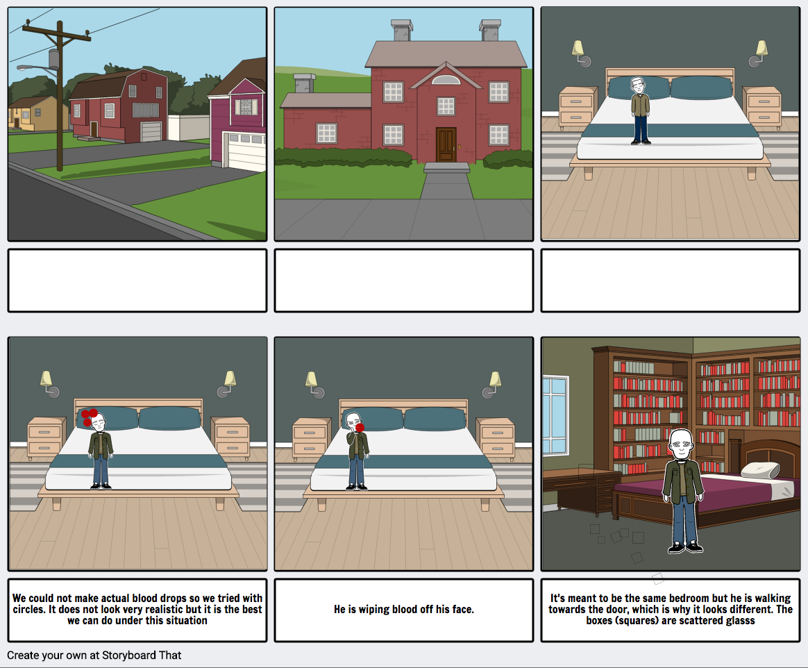
1) Extra long shot of the house
2)Long shot of the house - windows open and close, the door is open
3)Birds eye view, medium long shot of Anthony sleeping
4)Birds eye view, medium long shot of blood dripping down Anthony face
5)Birds eye view, medium long shot of Anthony wiping the blood off his face (he is groggy)
6)Long shot of Anthony sitting up with blood smeared across his face
7)Walking to the door, see shattered glass and scattered clothes in the background (Anthony does not realize it)
8)Long shot of Anthony walking through the hallway, in the background you can see a hand on the floor with cuts on the wrist
8)Anthony is washing his face, in the background we see a pair of legs on the floor (long shot)
9)Anthony is centimeters away standing next to the legs, but cannot see it, has a facial expression of confusion (he knows something is wrong but he is not sure what) (long shot)
10)Walking in to the kitchen, in the background, the storage room has Niamh's dead body (long shot)
11)Anthony gets a bowl of cereal, turns to his left and see's an image of his best friends with an 'X' on top
12)Close up of the image
14)Anthony slowly puts down cereal bowl (Medium shot, back view of him)
15)Backing up holding photo (long shot)
16)Yells "Catalina!"
17)Walks past hallway, notices body (long shot)
18)Close up shot of her leg lying down (hand by her sand with cuts on it)
- Her chest
- Her face (with a slit)
19)Looks at Catalina - heartbeat, heavy breathing, sweating
20)Drops to floor, yells "Catalina!" and shakes her (long shot)
21)Ran down the hallway, stumbles over hand
22) Looks down (Camera on floor)
23)Look of horror, "What's going on in this house?"
24)Anthony squats to the floor, "Ali?"
25)Close up of Ali's face (with blood dripping down his eyes)
- his chest (cuts on hands)
26)Anthony looking around the house, opens door and runs out
 A few of the sounds used:
- Tension building music
- Heartbeat
- Footsteps
- Water running (when he is washing his hands)
The Pitch, Mise-En-Scene Location & Setting - Sama
 |
| Screenshot from Google Maps to show where it is |
LOCATION & SETTING
The location is at my (Sama's) house within Camden. We will see this throughout the title sequence, as it is our main location. It'll be used throughout the majority of the shots, from the character introductions to the closing shots. We chose to use this as it fits in with the idea of the film as it is quite close to Camden Market, and is the most conventional (distance wise) for us.

The outside of the house
PLANNING- Task 2- Design of our own credits ( Ali Demirkan )
On this blog post i will be talking about our credits for our own film. I'll be including 5 factors which are; Typeface/font, Transitions/ effects, Colour of font, pace and movement and how they contrast with the action.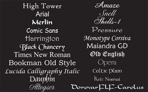
Typeface/ Font used:^^^^^^ Here is an example of many font types, some are really good and some are really bad. For example; for our own film we would we using a similar font type to the one which says ' Pressure' this is because I believe it would suit the background of the film because its thin writing not thick. Therefore, we can fit more things to say in the title sequence. Furthermore, the writing is going to be in ' White ' due to the reason we're going to film in the dark and white and black goes together. Also, many popular title sequences used that type of font such as; Ghost protocol, expendables and many more. On the other hand, if we was to use the font type which says ' snell' that wouldn't be good for us and the audience because they wouldn't understand what is written, its not that clear and would not appeal to our target audience of 18-25 year olds.
Use of transitions and/ or effects: We would use transitions for our logo ident before the title sequence like we did previously. We could use the glitch effect as it would suit the background of our film or even the genre. We wouldn't use anything that's childish as our target audience is 18-25 so the logo ident has to be suitable for them. Also, the logo ident shouldn't be anything too cliche. In addition, in our film there would be many fades so we are going to need to use transitions to slowly fade from one scene to another. Moving onto the effects we would use in our film, there are many effects such as, 'Heart beat', 'breathing ', and the ringing you hear in your ears and many more. 'Heart beat' is one of the best effects out there because it grabs the audiences attention and they start asking themselves 'Whats going to happen next?'. Its a great way to build tension. Also, the 'Heavy breathing' will be used with a mixture to the 'heart beat' to make the audience understand that its a life and death situation.

Use of colour:^^^^ The colour palettes that we're going to use for our film will be dark colours, burgundy, deep red and orange. This is because our film will be filmed in the dark so these are the suitable colour palettes that we would be using. We cant use light colours because that would be weird and not fitting in with the film and the plot and we are also filming in the dark and light colours wouldn't match.
Pace and movement of the titles: The pace of the titles would be definitely 'Slow'. This is because if it was fast then the audience wouldn't have the time to read what the credits are saying. For our re-make of ' Gone Girl ' our titles are were pretty fast and we couldn't read what written so we have to improve that for our film. Also, the titles are ' Slow ' to suit whats happening in the background of our film. If the background is fast then the titles should be fast too so it could match.
How do they integrate or contrast with the action behind them?: As i said before, it should suit whats happening in the background. Fit in with everything but not take attention away from the film.

Typeface/ Font used:^^^^^^ Here is an example of many font types, some are really good and some are really bad. For example; for our own film we would we using a similar font type to the one which says ' Pressure' this is because I believe it would suit the background of the film because its thin writing not thick. Therefore, we can fit more things to say in the title sequence. Furthermore, the writing is going to be in ' White ' due to the reason we're going to film in the dark and white and black goes together. Also, many popular title sequences used that type of font such as; Ghost protocol, expendables and many more. On the other hand, if we was to use the font type which says ' snell' that wouldn't be good for us and the audience because they wouldn't understand what is written, its not that clear and would not appeal to our target audience of 18-25 year olds.
Use of transitions and/ or effects: We would use transitions for our logo ident before the title sequence like we did previously. We could use the glitch effect as it would suit the background of our film or even the genre. We wouldn't use anything that's childish as our target audience is 18-25 so the logo ident has to be suitable for them. Also, the logo ident shouldn't be anything too cliche. In addition, in our film there would be many fades so we are going to need to use transitions to slowly fade from one scene to another. Moving onto the effects we would use in our film, there are many effects such as, 'Heart beat', 'breathing ', and the ringing you hear in your ears and many more. 'Heart beat' is one of the best effects out there because it grabs the audiences attention and they start asking themselves 'Whats going to happen next?'. Its a great way to build tension. Also, the 'Heavy breathing' will be used with a mixture to the 'heart beat' to make the audience understand that its a life and death situation.
Use of colour:^^^^ The colour palettes that we're going to use for our film will be dark colours, burgundy, deep red and orange. This is because our film will be filmed in the dark so these are the suitable colour palettes that we would be using. We cant use light colours because that would be weird and not fitting in with the film and the plot and we are also filming in the dark and light colours wouldn't match.
Pace and movement of the titles: The pace of the titles would be definitely 'Slow'. This is because if it was fast then the audience wouldn't have the time to read what the credits are saying. For our re-make of ' Gone Girl ' our titles are were pretty fast and we couldn't read what written so we have to improve that for our film. Also, the titles are ' Slow ' to suit whats happening in the background of our film. If the background is fast then the titles should be fast too so it could match.
How do they integrate or contrast with the action behind them?: As i said before, it should suit whats happening in the background. Fit in with everything but not take attention away from the film.
Tuesday, 15 November 2016
Studio Distributor and Institution (Jerome Lister 4)
Which company is likely to distribute the film you are creating a title sequence for?
The film company that is most likely to distribute the movie intro that my group are creating is New Line Film Productions. Often simply referred to as New Line Cinema, is an American-French film studio founded in 1967 by Robert Shaye as a film distribution company. It's an extremely well respected film company as it has distributed films such as The Conjring, Se7en, The Lord of the Rings Trilogy and the Hobbit Trilogy, all being films who have won many awards and accolades and topped the box offices with a domestic gross of $300,000,000. Being reason as to why my group have chosen this prestigious film company.


The film company that is most likely to distribute the movie intro that my group are creating is New Line Film Productions. Often simply referred to as New Line Cinema, is an American-French film studio founded in 1967 by Robert Shaye as a film distribution company. It's an extremely well respected film company as it has distributed films such as The Conjring, Se7en, The Lord of the Rings Trilogy and the Hobbit Trilogy, all being films who have won many awards and accolades and topped the box offices with a domestic gross of $300,000,000. Being reason as to why my group have chosen this prestigious film company.

Representation (Jerome Lister 3)
Which characters will you introduce or make reference to in your title sequence?
One of the three characters, Anthony played by me will be introduced in the title sequence while a medium birds eye view shot will be taken of him as he's sleeping in his bed with the credits of his name being displayed on the screen through a fade in effect. Additionally the character of Catalina played by Niamh will be introduced in the title sequence through a long shot of her in the closet murdered as Anthony opens the closet with her name also fading in as credits. Ali played by Ali will be introduced through a medium shot of his hand being lade on the floor in a hall way half way through the title sequence with his name fading in as credits
E.G
 What social groups are evident in our opening?
The social groups that will be evident in our movie intro are primarily working class people, as council houses are predominantly housing that particular social group.
 How do you represent these groups - stereotypically or do you challenge stereotypes?
In our movie intro we'll represent working class people steriotypically as we want this title sequence to be realistic as possible when relating to context and especially with the way the house it built and designed.
One of the three characters, Anthony played by me will be introduced in the title sequence while a medium birds eye view shot will be taken of him as he's sleeping in his bed with the credits of his name being displayed on the screen through a fade in effect. Additionally the character of Catalina played by Niamh will be introduced in the title sequence through a long shot of her in the closet murdered as Anthony opens the closet with her name also fading in as credits. Ali played by Ali will be introduced through a medium shot of his hand being lade on the floor in a hall way half way through the title sequence with his name fading in as credits
E.G

The social groups that will be evident in our movie intro are primarily working class people, as council houses are predominantly housing that particular social group.

In our movie intro we'll represent working class people steriotypically as we want this title sequence to be realistic as possible when relating to context and especially with the way the house it built and designed.
Monday, 14 November 2016
PLANNING- Task 3 - Order of credits of our OWN fillm( Ali Demirkan )
Production Ident: XXL STUDIOS
Distribution in title sequence: XXL Elements
Actor 1: Ali Demirkan
Actor 2: Sama Ansari Pour
Actor 3: Niamh walker
Film name: Drained
Costume: Sama
Music supervisor: Jerome
Music by: Niamh
Edited by; Ali Demirkan and Sama Ansari Pour
Production Designer: Sama
Director of photography: Niamh
Executive producer: Sama, Niamh Walker, Ali Demirkan and Jerome Lister
Written by: Sama, Ali and Jerome
Director: Niamh and Sama
PLANNING- Task 3- Conventional order ( Ali Demirkan )

Within film there is a conventional order in which people are credited at the start of any film and as I have found out that they have to be in a specific order so I have done some research to find out what order the opening credit sequence must be in. this make the film look professionally made.
Here if the order of which the credits must be in:
Production Ident
Distribution Ident
Distribution in Title Sequence
Production in Title Sequence
Actor 1
Actor 2
Film Title
Actor3
Actor 4
Actor 5 etc
Casting
Costume
Music Supervisor
Music by
Edited by
Production Designer
Director of Photography
Executive Producers
Written by
Director
Sunday, 13 November 2016
PLANNING- Task 1- Analyse titles and credits ( Ali Demirkan ) ( 2 )

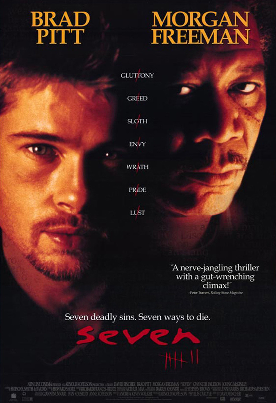
Name of film: Se7en
Typeface/ Font used: The title sequences uses great font styles to suit the genre of the film. This is because the font is written as if someone wrote it with a knife, i said ' Knife ' because the title sequences uses many pictures of serial killers so I'm thinking that they wanted to link the serial killer back to the font type.
Use of transitions and/ or effects: The transitions of the opening sequence vary, some are straight cuts and some cross fade or fade to black. The fading gives the effect of the clips being linked together and creates an eerie feel, and the fade to black reflects the sincerity and darkness of the overall film. Also, some of the special effects include the clips being in slow motion, this creates a more sombre tone and allows the audience to properly see what they are doing on the screen. In addition, there are also animations of flickering on the screen during some of the shots. This is used to create an eerie effect on the shots.
Use of colour: The colours used in this specific title sequence is ' black and red' this already sums up what the genre of the film is about. ' Red ' defines blood (the serial killer) and the ' black' to set the tone of the title sequence.
Pace and movement of the titles: As the sequence builds up and gets faster towards the end, it creates tension for the audience, and shows that it will be a tens film to watch.
How do they integrate or contrast with the action behind them?: For example; at the begging of the title sequence the pages flicking is in a slow pace, However, getting to the middle/ end the pages start to flick very fast.
Overview of why you like the title design in the sequence?: I like this title sequence mainly because during the opening sequence, most of the camera shots are still. There is not much panning or any other kind of movement as all of the shots focus on one main thing and keep it as the centre of the shot.
PLANNING- Task 1- Analyse titles and credits ( Ali Demirkan ) ( 1 )

Name of film: Napolean Dynamaite
Typeface/ Font used: Different fonts are used throughout the sequence, for example handwriting is used when the titles are shown of food, and types bold font is used when it shown on the ID card, types is used when it appears on the lozenge pack as well.
Use of transitions and/ or effects: The sequence is simply edited with not many effects, which allows the music and the video to create a smooth and easy to watch title sequence which matches the genre,. The editing is slow, with quite long shots, to match the calm pace of the music. There area a few deliberately out of focus shots that became in focus, such as the book receipt.
Use of colour: The title sequence uses light colours such as; light blue, yellow, light green to suit the genre because its comedy the title sequence colours suit the genre of the film. However, if the genre of the film was horror then they wouldn't of used light colours, they would use dark colours. In addition, the use of light colours attract the audience because it makes the background brighter.
Pace and movement of the titles: Each title stays on the screen for 6 seconds each, with a 3 second gap between each title appearing. We would use this timing for our own title sequence.
How do they integrate or contrast with the action behind them?: This then suits the action because its a 3 minute title sequence and they gathered many things due to the 6 seconds each, with a 3 second gap between each title. Therefore, the audience understands the concept of the film.
Overview of why you like the title design in the sequence?: We would use this title sequence as an inspiration to my work in the way of not using actors and just focusing on the titles in a creative way. Also, i love the way there is only one stop type in the title sequence and that the point of view shot. This makes me feel like I'm in the scene as though i was looking at the objects.
Friday, 11 November 2016
Influences from Other Films (Sama Ansari Pour)

When analysing the film Shutter Island, one aspect of sound that we found particularly influential was the fact that you they used sound before you saw an image, giving hints of making the audience want more. As the sound goes on, you get some understanding of what the sound is symbolizing, making the view make their own version of what they are viewing within the film. We hope to adapt this into our own opening sequence through when showing establishing shots, giving the viewer a hint of what is yet to be shown and they can create an idea of the story themselves.

Finding a Distribution Company - American Psycho (Sama Ansari Pour)
 The film we chose to examine is 'American Psycho' created in 2000. They have a quite a few distribution companys, for example Lionsgate Film, Odean and Gold Max. One way they distributed the film was by inviting people to register to receive emails (based off the plot), enabling them to feel as if they are in the film and to create hype and tease them into wanting more. Lionsgate spent $50,000 on an online stock market game where the player can invest in films, actors or musicians with fake Hollywood money.
They used social media to their advantage to spread film posters - teaser film posters as included via accounts and hashtags, on social media such as Twitter. This is effective in fulfilling it's purpose as users can share these snippets of the film with their friends at a touch of a button, 'like' it and comment, which would show up in their followers notifications.
The film was globally released, from the USA to Japan. It was also released at popular film festivals, for example the Sundance Film Festival. This creates more hype, especially with famous names, which advertises it even further.
The film is available digitally (Netflix, Amazon Prime), on DVD or Blu Ray. The box office sales was $34.3 million, generating a good profit. Originally it was meant to have a soundtrack, with famous names such as Bowie but all copies were destroyed as the makers of the film felt that it did not go with the film.
We feel like this distributor would be likely to distribute our film as we have a similar genre of Thriller, which makes the idea more appealing. Furthermore, they are more experienced in distributing our sort of film into a market, which would heighten the chance of success.
The film- Niamh
What is the title of the film?
Drained
Whats the treatment? (outline of whole film)
A young teenager called Anthony has his friends sleeping over at his house. When he wakes up he comes across a number of clues within his house, later to realise that all his friends have been brutally murdered. Leaving him clueless to how this happened and to why he is the only one still alive.

Wednesday, 9 November 2016
My Genre Shortlist


I chose this genre as it is similar to thriller but would be more freeing within the costume and makeup section. The settings are normally urban enviroments, dark streets and narrow alleys. Camera work is very expensive and not natural; high and low an angle connotes fear. The viisual style is often dark colours like red & black (links to evil, blood and danger etc). The costume and makeup is limitless, as you can make someone into a monster or a normal person./
Subscribe to:
Posts (Atom)